FlexView Bar Graphs
In a FlexView tab, click the Bar Graph button
![]() in the FlexView toolbar
to display the FlexView data in a bar graph format. The bar graph is situated
above the FlexView table; all of the table features remain active while the bar
graph is displayed. The bar graph
area is split into three sections:
in the FlexView toolbar
to display the FlexView data in a bar graph format. The bar graph is situated
above the FlexView table; all of the table features remain active while the bar
graph is displayed. The bar graph
area is split into three sections:
- Graph - the left section shows the actual bar graph
- Legend - the middle section displays a legend that relates the colors in the graph to the attributes being displayed in the graph
- Graph Settings - the right section contains two tabs that allow you to configure the bar graph
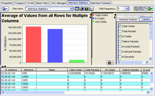
A bar graph provides a snapshot showing information as vertical bars. Each color-coded bar can represent either independent or related attribute values. Bar graphs are the best tool for comparing unrelated columns. For example, to present a profile of received vs. transmitted packets for a specific number of samples or to show a correlation between two FlexView columns. Holding the mouse pointer over a particular bar will show a tool tip that identifies that value.
Sample Bar Graph.
-
 Drop-Down Menu Button
 - Click this button to display bar graph menu options:
- Export Graph - This option lets you export the currently displayed bar graph information as a BMP, JPG, PNG, or TIFF formatted image file.
- Print Graph - This option lets you print the currently displayed bar graph.
Bar Graph Settings
The Columns tab and General Controls tabs are used to configure the bar graph. In the Columns tab, select the columns you want displayed in the bar graph. The General Controls tab changes depending on the number of columns selected in the Columns tab.
With multiple columns selected
With multiple columns selected, the choices on the General Controls tab let you choose
the Maximum, Average, or Minimum values from all rows. You can compare
columns to show the highest, average or lowest values for each of the selected columns.
With a single column selected
With only one column selected in the Columns tab, the General Controls tab lets you specify the following information.
General Controls - Single Column Selected
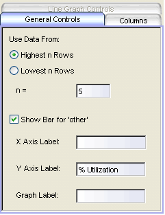
- Highest n Rows, Lowest n Rows, n=
- With a single column selected, you can show the data for the specified (n) rows with the highest or lowest values for the selected column.
| NOTE: | If you set n= to a number greater than the number of rows in the table, the graph will
only show the rows available from the table; if you also check Show Bar for other, then a
bar for other will be shown as zero in the graph and the legend. For example, if you are
graphing values for the highest five rows (or four rows with Show Bar for other checked), but
have only four rows selected in the table, only four rows will be graphed and the bar for other will
be zero. |
|---|
- Show Bar for Other
- When checked, a bar labeled Other is added to the graph to show the sum of the values from all of the rows not specifically selected on the Columns tab.
- X-Axis Label, Y-Axis Label, Graph Label
- These fields allow entering text titles for the X and Y axes and the title that appears above the graph.
| NOTE: | These labels can only be defined when there is a single column selected. However, once the labels are entered, you can select additional columns and retain the same labels. |
|---|
For information on related windows:
For information on related tasks: