FlexView Line Graphs
In a FlexView tab, click the Line Graph button ![]() in the FlexView toolbar to
display the FlexView data in a line graph format.
You can use line graphs to view the trends (over time) for various combinations of information.
The line graph is situated above the FlexView table; all of the table features
remain active while the line graph is displayed. The line graph area is split
into three sections:
in the FlexView toolbar to
display the FlexView data in a line graph format.
You can use line graphs to view the trends (over time) for various combinations of information.
The line graph is situated above the FlexView table; all of the table features
remain active while the line graph is displayed. The line graph area is split
into three sections:
- Graph - the left section shows the actual line graph
- Legend - the middle section displays a legend that shows the particular column or row associated with the colors for each line
- Graph Settings - the right section contains three tabs that allow you to configure the line graph
When you display a line graph it also adds a Graph Data tab to the table below. The Graph Data tab shows the graph data in tabular format. Each poll cycle appends rows to the table to show the values returned for the selected data. The Sample column is incremented with each poll cycle. The Graph Data table is limited to 65,000 rows and wraps around, overwriting rows 1, 2, etc. after reaching this limit.
Scientific notation is used in the Graph Data to show very large and very small values. Scientific notation presents values in the base 10, using an exponent and decimal point to present these values. For values less than one, the exponent is expressed as a negative number to show a number of decimal places to move to the left the decimal point to express the same value as an integer. For example, the value 0.0000345 could be expressed in scientific notation as 345e-7 or 3.45e-5. For values greater than one, the exponent is expressed as a positive number to show a number of decimal places to move to the right the decimal point to express the same value as an integer.. For example, 3,450,000 could be expressed as 3.45e6 or 345e4.
The Poll Frequency setting determines the interval for the X axis (time division) shown on the graph. You can select a pre-defined poll setting from the drop-down list or type a value directly into the Poll Frequency field. The frequency must be set to a non-zero value and the ![]() (Retrieve button) must be clicked to plot information trends with the
line graph. When there is no information returned from a device for a poll, the line is interrupted (blank) for that poll interval. Holding the mouse pointer over a particular line will show a tool tip that identifies that value.
(Retrieve button) must be clicked to plot information trends with the
line graph. When there is no information returned from a device for a poll, the line is interrupted (blank) for that poll interval. Holding the mouse pointer over a particular line will show a tool tip that identifies that value.
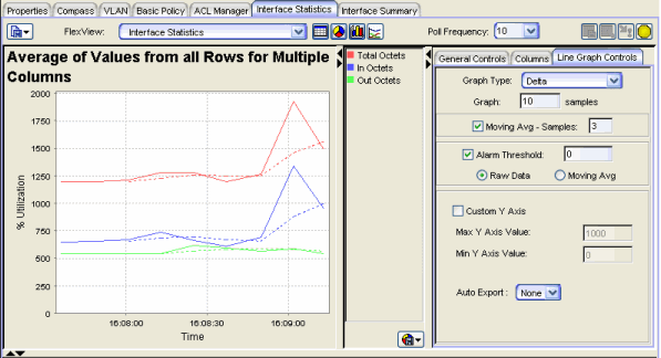
Sample Line Graph
-
 Drop-Down Menu Button
 - Click this button to display line graph menu options:
- Export Graph - This option lets you export the currently displayed line graph information as a BMP, JPG, PNG, or TIFF formatted image file.
- Print Graph - This option lets you print the currently displayed line graph.
- Export Data - Opens a file browser where you can select a name and location for exporting the information currently displayed in the Graph Data tab of the table to a file. The file is exported as an HTML or spreadsheet-compatible CSV file. The default format is HTML and the default filename is <current FlexView name>_Graph_Data.html . For example, Interface_Summary_Graph_Data. There is no default name when exported as CSV.
Line Graph Settings
The General Controls tab, the Columns tab, and the Line Graph Controls tab are used to configure the line graph. In the Columns tab, select the columns you want displayed in the line graph.
General Controls Tab
The settings on this tab change according to the number of columns selected in the Columns tab.With multiple columns selected:
With multiple columns selected in the Columns tab, the General Controls tab lets you choose
the Maximum, Average, or Minimum values from all rows. You can compare
columns to show the highest, average, or lowest values for each of the selected columns.
With a single column selected:
With only one column selected in the Columns tab, the General Controls tab lets you specify the following information.
General Controls Tab - Single Column Selected
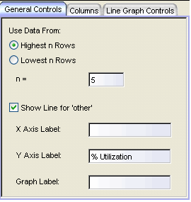
- Highest n Rows, Lowest n Rows, n=
- With a single column selected, the graph shows the data for the specified n rows with the highest or lowest values for the selected column. A (blank) gap in a line indicates that there was no response from the device for that poll and no point was plotted. The selection of the highest or lowest rows to be plotted is determined by the values returned from the first query and these rows will remain selected regardless of the values returned from subsequent queries.
| NOTES: |
|
|---|
- Show Line for other
- When checked, a line labeled Other is added to the graph to show the sum of the values from all of the rows not specifically selected on the Columns tab.
- X-Axis Label, Y-Axis Label, Graph Label
- These fields allow entering text titles for the X and Y axes and the title that appears above the graph.
| NOTE: | These labels can only be defined when there is a single column selected. However, once the labels are entered, you can select additional columns and retain the same labels. |
|---|
Line Graph Controls Tab
This tab determines how the selected columns will be presented in the graph.
Sample Line Graph Controls
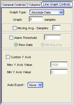
- Graph Type
- This drop-down list lets you select from four graph types:
- Absolute - plots the selected columns as the accumulated value obtained during the selected poll interval, on a linear y-axes scale.
- Log Absolute - plots the selected columns as the accumulated value obtained during the selected poll interval, on a logarithmic y-axes scale.
- Delta - plots the selected columns as the accumulated value that is amount of the change from the preceding value, per selected poll interval, on a linear y-axes scale.
- Rate - plots the selected columns as a value per second, on a linear y-axes scale.
- Moving Avg - Samples
- When checked, the value that is plotted on the graph will be calculated as the arithmetic mean derived from the number of preceding samples specified in the associated Samples field.
- Alarm Threshold
- When checked, an alarm is generated when the value computed for any selected column equals or exceeds the value specified in the field to the right of the checkbox. The computed value can be the Raw Data from the table or a Moving Average (using the number Samples specified for the Moving Average above). The alarm threshold can be triggered by Raw Data or a Moving Avg using Absolute, Delta, or Rate values for the data in the selected column(s). This feature will only generate alarms while the Line Graph is being displayed.
- Custom Y Axis
- When checked, the Max Y Axis Value and Min Y Axis Value fields are enabled to allow you to set the limits of the Y axis by setting a minimum and/or maximum value.
For information on related windows:
For information on related tasks: