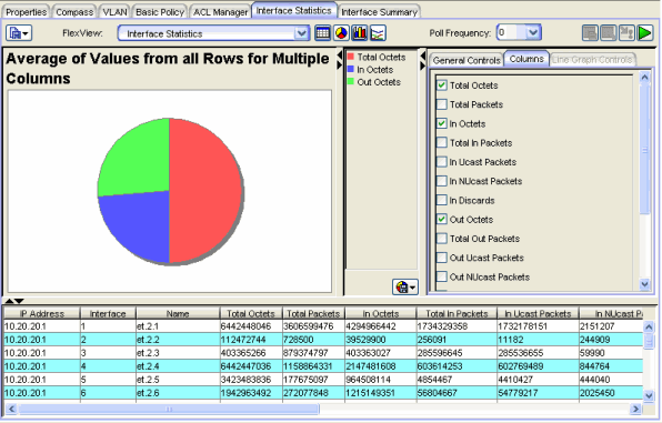
FlexView Pie Graphs
In a FlexView tab, click the Pie Graph button ![]() in
the FlexView toolbar to
display the FlexView data in a pie graph format. The pie graph is situated above
the FlexView table; all of the table features
remain active while the pie graph is displayed. The pie graph area is split
into three sections:
in
the FlexView toolbar to
display the FlexView data in a pie graph format. The pie graph is situated above
the FlexView table; all of the table features
remain active while the pie graph is displayed. The pie graph area is split
into three sections:
- Graph - the left section shows the actual pie graph
- Legend - the middle section displays a legend that shows the particular column or row associated with the colors in the pie
- Graph Settings - the right section contains two tabs that allow you to configure the pie graph
Sample Pie Graph
 Drop-Down Menu Button
- Click this button to display pie graph menu options:
- Export Graph - This option lets you export the currently displayed pie graph information as a BMP, JPG, PNG, or TIFF formatted image file.
- Print Graph - This option lets you print the currently displayed pie graph.
Pie Graph Settings
The Columns tab and the General Controls tabs are used to configure the pie graph. In the Columns tab, select the columns you want displayed in the pie graph. Each column that is selected will be displayed as a slice in the pie. If only one column is selected, the pie shows the share of the pie for the specific number of rows set in the General Controls tab as a slice in the pie. The General Controls tab changes depending on the number of columns selected in the Columns tab.
With multiple columns selected:
With multiple columns selected, the choices on the General Controls tab let you choose
the Maximum, Average, or Minimum values from all rows. You can compare
columns to show the highest, average or lowest values for each of the selected columns.
With a single column selected:
With only one column selected in the Columns tab, the General Controls tab lets
you specify the following information.
General Controls - Single Column Selected
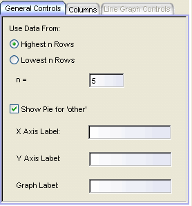
- Highest n Rows, Lowest n Rows, n=
- With a single column selected, you can show the data for the specified (n) rows with the highest or lowest values for the selected column.
| NOTE: | If you set n= to a number greater than the number of rows in the table, the graph will
only show the rows available from the table; if you also check Show Pie for other, then a
slice for other will be shown as zero in the graph and the legend. For example, if you are
graphing values for the highest five rows (or four rows with Show Pie for other checked), but
have only four rows selected in the table, only four rows will be graphed and the
slice for other will
be zero. |
|---|
- Show Pie for Other
- When checked, a slice labeled Other is added to the graph to show the sum of the values from all of the rows not specifically selected on the Columns tab.
- X-Axis Label, Y-Axis Label, Graph Label
- These fields allow entering text titles for the X and Y axes and the title that appears above the graph.
| NOTE: | These labels can only be defined when there is a single column selected. However, once the labels are
entered, you can select additional columns and retain the same labels. |
|---|
For information on related windows:
For information on related tasks: